City University London – Complex Data Visualisation
Former Hewlett-Packard president Carly Fiorina once said that “the goal is to turn data into information, and information into insight”.
Humans have used visual aids such as charts and maps to understand and interpret information for generations. As the amount of data we can collect increases, how do we visualise it in a understandable way that helps us to take action?
Across the world, there is a growing community of researchers looking into how to approach the visualisation of this century’s more complex datasets. Amongst these groups is the giCentre, a team of academics at City University London that has developed software and techniques for interpreting this data in visual forms. The giCentre has spent several years working with organizations including Local Authorities, the Ministry of Defense, the British Library, Transport for London and energy firm E.ON.
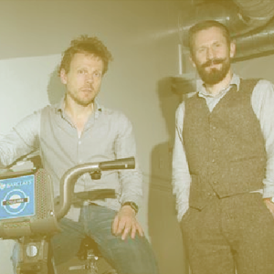
Jason Dykes & Jo Wood
Image Credit: Mike Abrahams
“It’s all about shedding light on complexity with simplicity”, says Jason Dykes, professor of visualization at the centre. “We see visualisation as a really interesting solution to a broad range of challenges associated with making sense of large data sets.
We’re trying to provide richer contextualised views of data, which gives more insight to decision makers.
There is a lot of discussion into how to improve processing and machine learning to meet the challenge of Big Data. Dykes believes that visualisation is often overlooked in that discussion, and that it should have a prominent role to play in the future Big Data research.
“We really believe that Big Data needs the visualisation discipline”, he says. “It’s important to recognise the value of good visual design as part of Big Data work, and to draw on the knowledge and technology that the visualisation community has developed.”
A particularly fruitful area of the giCentre’s research has been in using principles from cartography and information visualisation to present non-spatial information in interesting and informative new ways. Both Dykes and Professor of Visual Analytics Jo Wood are experienced in cartography and Geographical Information Science, and the group also features experts in visual analytics, geo-spatial analysis and applied data science.
“We seek out interesting problems to solve”, says Dykes. “We try to find combinations of people with needs and data with interesting characteristics, that stretch the current limits of visualisation.”
“It’s a process of showing people what is achievable, keeping your eyes open to see interesting possibilities, and then engaging with people to learn together so that they can make more of their data and we can expand our knowledge of visualisation and the application domains in which we use it.”
 In one case, the giCentre worked with Leicestershire Library Service to visualise data from the TALIS database, a detailed dataset containing weekly information on lending and customers at 54 libraries across the county. The process aimed to address questions on how performance varied at each library, where the key customers lived, and whether the library could predict usage based on a customer profiles.
Using data on 435,000 active library users collected over a two-year period, the giCentre structured and filtered the information, removing personal details.
“We get people’s data visualised quite quickly using sketches, and then we iterate and flesh out our designs”, says Dykes. “It’s a way of enabling people to see what they have, and asking them how they want to delve further into it.”
In this case, researchers adapted several visualisation methods to incorporate geospatial information. Using recognised techniques such as Spider Plots and Tree Maps, they preserved the geographical context which helped them to reveal subtle patterns in the data. These included the number of lapsed users in a certain area, lower numbers than expected in others, and whether some customers bypassed their own local library to visit another one further away.
The giCentre’s research findings – such as the development of Spatial Tree Maps – usually emerge when the team has to take a creative approach to mine an organisation’s data for the insight it needs.
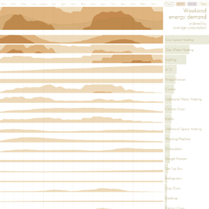
An interactive visualization of daily appliance usage designed as part of a project with E.ON
How do organisations benefit from visualisations such as these? In one case, leading energy supplier E.ON had collected around 18 million data points from a 100-house Smart Home technology trial in Milton Keynes. Work with the giCentre and City’s Centre for Creativity in Professional Practice resulted in four visualisation prototypes being developed. These showed daily peaks and troughs in energy demand, broke down consumption by appliance, pin-pointed trends or unusual instances, and allowed E.ON to gauge the impact of energy-saving technologies.
“You could spend months searching that amount of data for insights”, said one E.ON data analyst. “But this just points you straight at it.”
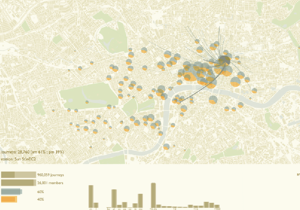
Researchers also worked with Transport For London’s Cycle Delivery Planning team to raise their awareness of cycling behaviour, particularly where cyclists start and finish their journeys and how they behave. The project has influenced where the organisation places bikes for its cycle hire scheme.
“We had data on over 20 million journeys. If you try and plot that conventionally, you get a hairball”, says Dykes. “We made judicious design calls, and highlighted the most important aspects of those journeys.
The study identified previously undiscovered patterns, such as how cyclists respond to station closures, the differences between locals and commuters, and the fact that female cyclists seem less likely to cross the Thames than their male counterparts.
“What TfL became interested in was trying to remove some of the noise in the data sets and look at the interesting structure underneath. We looked at where the workplaces were, as we wanted to remove the commuting patterns and see what happened under that. We ended up being able to see signals that were originally hidden in a mass of data.”
The Defence Science and Technology Laboratory also worked with the giCentre to develop approaches for analysing the reports and other intelligence emerging out of areas of conflict. These are unstructured, uncertain and often contradictory, making a rich means of representation such as visualisation particularly appropriate.
Building on what they have already learned, the researchers continue to visualise new data sets in a variety of fields. They are working with police forces in the UK and Belgium to interpret crime reports, and are part of an Arts & Humanities Research Council project to develop software and new research methods to analyse scores, music audio and metadata in large music collections. The Digital Music Lab project also draws on the skills of Queen Mary University of London, University College London and the British Library.
“The process of enquiry does not always have an obvious end point, as the more you find out the more questions you want to ask”, says Dykes. “People’s expectations change as they interact with data, and some of the discoveries change how they think about what they see.
“We’re trying to provide more detailed answers that show exactly where the patterns are and how they differ over time and geography. It gives just that little bit more to decision makers, and often results in organisations using data in new ways”
Links to Additional Information

You might also like to read:


Leave a Reply
You must be logged in to post a comment.